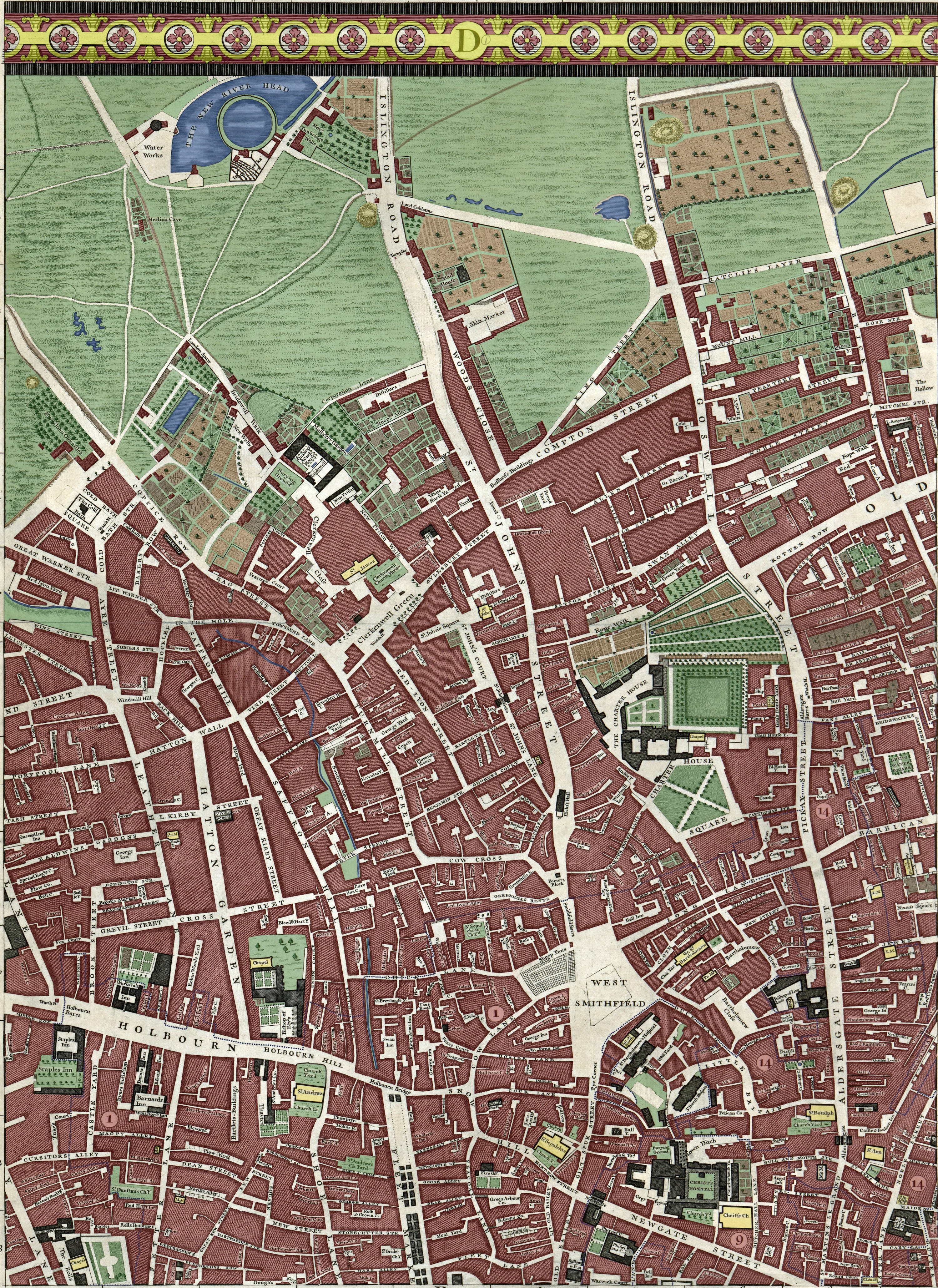
In Colour: A Map of Clerkenwell in 1746
My ongoing mission: to colour in one of the great maps of London.
Welcome to Londonist: Time Machine… a pleasurably geeky newsletter for anyone who likes London history.
![](https://substackcdn.com/image/fetch/w_1456,c_limit,f_auto,q_auto:good,fl_progressive:steep/https%3A%2F%2Fsubstack-post-media.s3.amazonaws.com%2Fpublic%2Fimages%2Ffbc1aa5e-b7d5-40ef-8593-6a3fd64ba8b6_3000x4119.jpeg)
This is Clerkenwell and its environs in 1746. George II is on the throne, America is still a British colony, hardly anyone in the city has heard of a steam engine, and a handful of well-heeled Londoners know what a pineapple tastes like.
The Georgian city is well known to us through countless written and illustrated sources but, for me, the greatest portal into the period is a map; specifically the John Rocque map of 1746.
Rocque’s map was by far the most detailed survey of London up to that point. Across its 24 sheets, you will find the names of thousands of alleys, wharves, lanes and landmarks, mapped in a clear, consistent style. And all of it was done, for the first time, with (reasonably) accurate surveying methods. It is, quite simply, one of the great treasures of London.
I’m colouring it in. It’s a slow and painstaking process, but richly rewarding. Today, I’m presenting part 7 (don’t worry if you’re new to this project… you can dip in at any point, and today’s map is as good a place as any to begin).
I’m adding colour to the map for several reasons:
(1) It helps us to see the patterns of land use (urban versus agricultural versus marsh and moor and meadow). It also reveals the hidden watercourses, City ward boundaries, churchyards, parterres, partitions and plantations that made up the 18th century city.
(2) It’s a lot of fun to spend many hours poring over my favourite map and, I suspect, I’m getting to know it better than anyone alive.
(3) It amuses my kids to know that daddy likes colouring things in as much as they do.
Today’s panel, the 7th of 24, includes the areas of Holborn, Clerkenwell, Smithfield and Finsbury, along with the north-west corner of the Square Mile, the original nucleus of London. By 1746, the town has filled out from its ancient bounds. We see near-continuous development all the way up to Old Street and beyond. A kind of buffer zone is then reached where the buildings thin out, giving way to market gardens and agriculture. The most northerly parts of the panel are almost entirely green, with undeveloped land used for pasture and brick-making. The area would remain this way for decades. The Horwood map of 50 years later still shows open fields. By Greenwood’s map of 1828, however, the land has been almost entirely swallowed by the march of the town.
I’m going to let the map do most of the talking in today’s newsletter. Explore it at your leisure and see what you can discover. But I would like to pick up on a few highlights below. I suggest you have a copy of the map open in a separate tab or another device, so you can alternate between the map and the commentary.
In Friday’s newsletter, I’ll provide a gazetteer of some of the more unusual street names and landmarks from this section (tune in then to find out what, “Merlin’s Cave” and “London’s Spaw” were).
Traces of the River Fleet
The London Thames is fed by dozens of smaller rivers, most of which are now covered over. Look on the John Rocque map, though, and these “lost rivers” are not quite so lost. The River Fleet is perhaps the most famous. It starts on Hampstead Heath and drops down through King’s Cross, on to Clerkenwell — where we see it on today’s map — before spilling into the Thames at Blackfriars. It’s easily missed on the original, but clear to see when some colour is added:
Its blue line is first glimpsed in the left edge of the map. It soon disappears beneath buildings, but re-emerges in an arc to the south. It then continues, more-or-less visible down to Holborn Bridge. The river valley was very steep — it is still. These slopes did not easily lend themselves to horse-drawn traffic. Consequently, very few roads span the river and, instead, a network of narrow alleys and pedestrian lanes grew up on the banks of the river. These lead up to Saffron Hill and Turnmill Street, roads that flank the Fleet Valley on the higher ground.
Of course, the Fleet would not have ran blue in this time period (if any). This stinking watercourse that was more sewer than river. To live on those slopes would not have been pleasant. This was a notoriously poor area, where Dickens chose to set the lair of Fagin and his gang.
By the map’s year of 1746, the lower reaches of the River Fleet had been covered over, all the better to mask the odour:
![](https://substackcdn.com/image/fetch/w_1456,c_limit,f_auto,q_auto:good,fl_progressive:steep/https%3A%2F%2Fsubstack-post-media.s3.amazonaws.com%2Fpublic%2Fimages%2F8c022491-67c1-4418-9c8f-b4b6135e2ceb_1628x1272.png)
Arches were built over the waterway and a paved surface placed on top (today’s Farringdon Street). It was then used as a commercial space known as Fleet Market. The stallholders here had shifted over from the old Stocks Market, which had been cleared to make way for the Mansion House (the Lord Mayor’s residence) just before Rocque’s map. If Google had existed to take a ‘Street View’ at the time, then it would have looked something like this:
The two rows of market buildings mirror what’s going on below-ground. If you go down into the sewer today (as I have), you’ll find that the buried Fleet bifurcates into two channels, just as the market ran in two rows. So I’m guessing that the market buildings were positioned to get maximum support from the river arches underneath.
The New River Head
The River Fleet is not the only aqueous content on our map. The most prominent feature of all, right at the top, is the reservoir of the New River Head. This mighty pool was the terminus of the New River — an artificial channel dug in the early 17th century to bring fresh water into the capital from Hertfordshire. We can see the New River just creeping into view to the east of the reservoir. The site would remain a place of watery administration, right into our own times. Most of the buildings have now been converted to residential use, but Thames Water still maintains a presence, with a pumping station for the London Water Ring Main to the west of the site.
One curious detail I noticed for the first time while colouring in the map… Look immediately south of the round pond to the label “Water Works”. The label covers a couple of dozen triangular shapes. I fancy these are elm pipes, commonly used for distributing water up to the 19th century. Cut from elm trunks, each section would taper at one end, so as to fit into the larger end of its neighbour, just as shown on the map. Islington Museum, a short distance from the site, has a surviving section of elm pipe from the New River, which I happen to have photographed. Perhaps the surveyor who drew this section of the map had cast his eyes on this very piece of wood.
The yellow ‘haystacks’
This section of the map contains a number of features that I’ve not seen on earlier panels. They resemble haystacks in shape and pen-line, and so I’ve coloured them yellow. I’m not convinced, however, that they do represent haystacks. Any theories?
One possibility is that we’re looking at mounds of spoil left over from London’s Civil War defences, of exactly a century before. They’re ever so slightly farther north than I would expect from maps of the defences, but not by much. We know, for example, that a fort existed beside Mount Mill, whose label is towards the bottom-right, not far from the central yellow pimple. Could the fortifications have been demolished and the rubble moved slightly to clear land for farming or development? I don’t know. Just a thought.
The wider map
Before I leave you, here’s a low-res compilation showing all seven panels I’ve coloured in so far, and the ones I’ll be tackling next. Remember, there are 24 in total, including panels to the sides and a bottom row, not shown below.
The files I’m working with are about 50 cm by 70 cm. That means the entire map, if printed out, would be four metres wide and over two metres tall. You can see why it’s taking many months to colour in! Any galleries or museums reading this, with a suitably sized wall… I’d love to hear from you. It’s my ambition to get the complete map printed out and displayed somewhere, once complete.
Previous sections:
Southwark and the western City (plus the 50 lost waterways of Southwark)
London Bridge, Borough and the eastern City (plus the lost waterways of Borough)
Wapping and part of Bermondsey (plus lost roads of the East End)
Bloomsbury (plus its dehydration)
In Friday’s newsletter, I will take a closer look at some of the more unusual place names in the present map panel.
Thanks for reading! As ever, please do leave a comment below or email me any time on matt@londonist.com. And please do help spread the word if you know somebody who likes maps, or London history, or both.
Very interesting, please keep going!
I'm loving this work you're doing on the Rocque map - thank you!
I have a question about the latest panel. Newgate Prison appears to have a presence on both sides of Newgate Street. Is this correct, and if so, does it lend more weight to some people's belief that the Viaduct pub did have cells in the basement? I never realised that the footprint of Newgate Prison was so small btw, now wonder it was so wretched for those inside.