


Colourised: 1746 Map of London Bridge and Surrounding Areas
Colourised: 1746 Map of London Bridge and Surrounding Areas
For the first time, the Georgian city is mapped in colour.

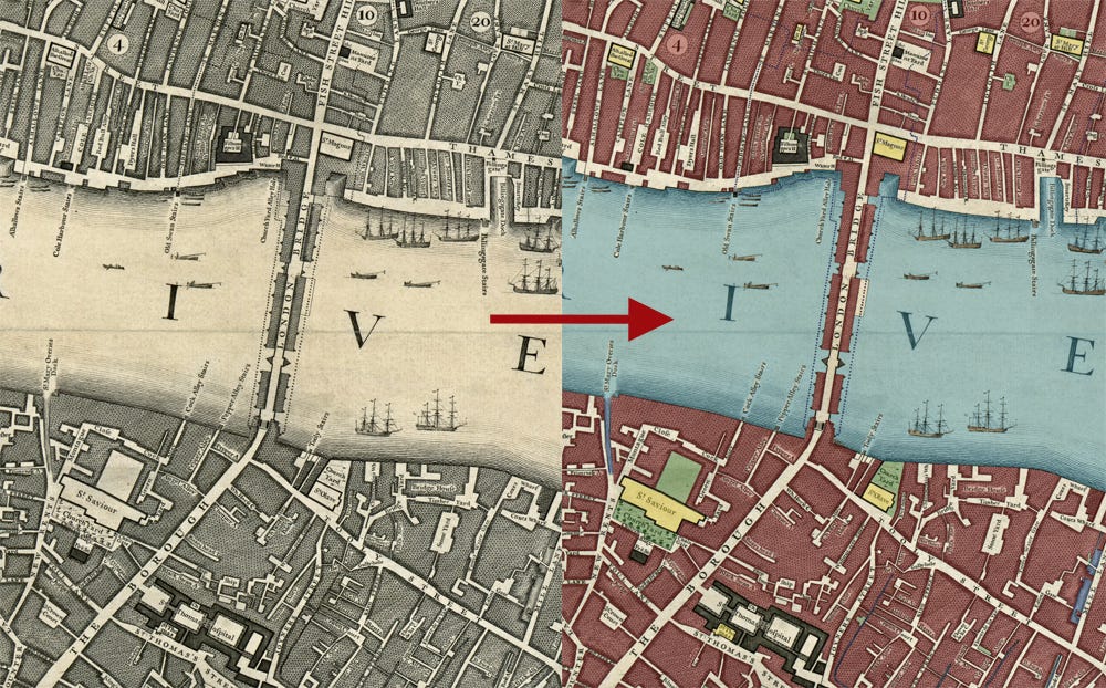
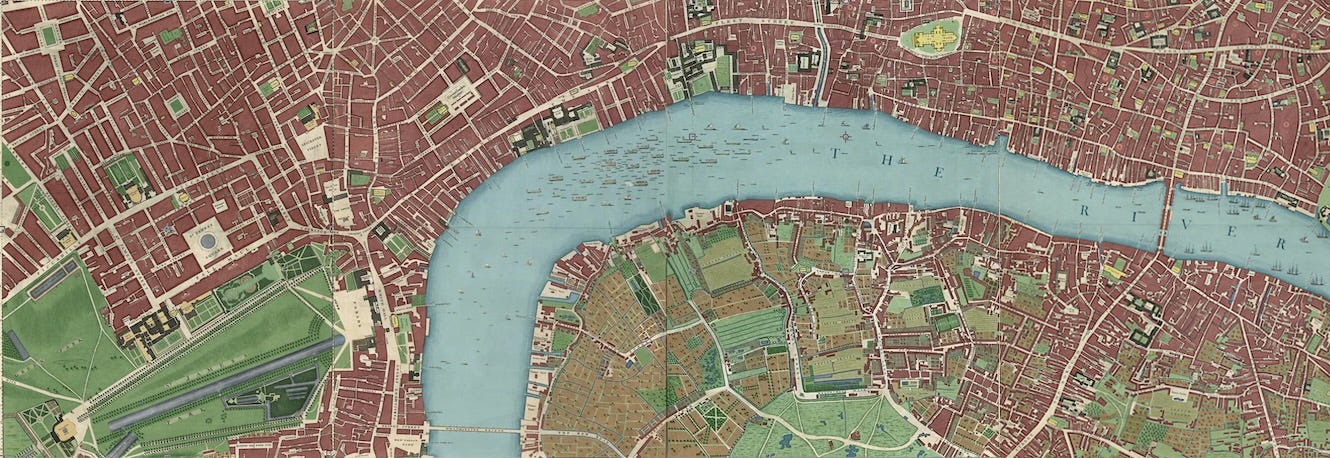
Welcome to Londonist: Time Machine. This week, we return to the John Rocque map of 1746, and my ongoing mission to colour in all 24 panels. This fourth installment features the eastern half of the City of London, and the transpontine realms of Southwark, Borough, Bankside and Bermondsey. By colouring in the individual buildings, rivers, churches, ward boundaries, orchards, fields and brooks, we get a much clearer picture of the 18th century city during one of its keenest growth spurts. And this is the most detailed map yet.
First, a quick message…
📣📣 PEDWAY PUZZLE: I hope you enjoyed last week’s double-header, in which I explored the aerial walkways (pedways) of the Square Mile, and then the historic parts of the Barbican. Inspired by the dream of the pedestrian city, I put together a fiendish puzzle over on Londonist.com. There exists a route by which you can walk from Bank station to Waterloo station without crossing any streets. Pedways are part of it. See if you can work it out, and then check the solution. You can only use publicly accessible routes (i.e. no sewers or walking along train tracks!) and cannot catch any form of transport. Supergeeks can also attempt the extended mission, which is to walk from Bank to Southwark tube without crossing the road.
Colourised: Map of London Bridge and Surrounding in 1746
Here is the City of London and Southwark as you’ve never seen them before. As no one has seen them before.
The map above has existed since John Rocque and his surveyors first published in 1746, but only in black and white. I’ve spent something like 30 hours meticulously colouring in every building, field, church, tree and stream.
Why? Well, partly as an elaborate way of procrastinating on my chores. But also out of curiosity. I’ve always been drawn to this map. The original is a masterpiece of cartography — by far the most detailed chart of London up to that point. But it’s too packed to parse. One can easily miss the brooks and streams that thread between buildings. Open fields, farmland and paved yards are not easy to distinguish from one another without zooming right in. The alleys and courtyards get lost among other pen strokes.
Add some colour and everything pops out. We can now readily distinguish different patterns of land use and get a better feel for the spread of Georgian London. The map comes alive1.
This is the fourth panel of the map I’ve coloured in. Paying subscribers can view the previous three in high resolution:
📍Bankside and western City
📍Lambeth and Westminster
📍Mayfair, St James’s, Soho and Royal Parks
Let’s take a look at some of the details in this fourth panel.
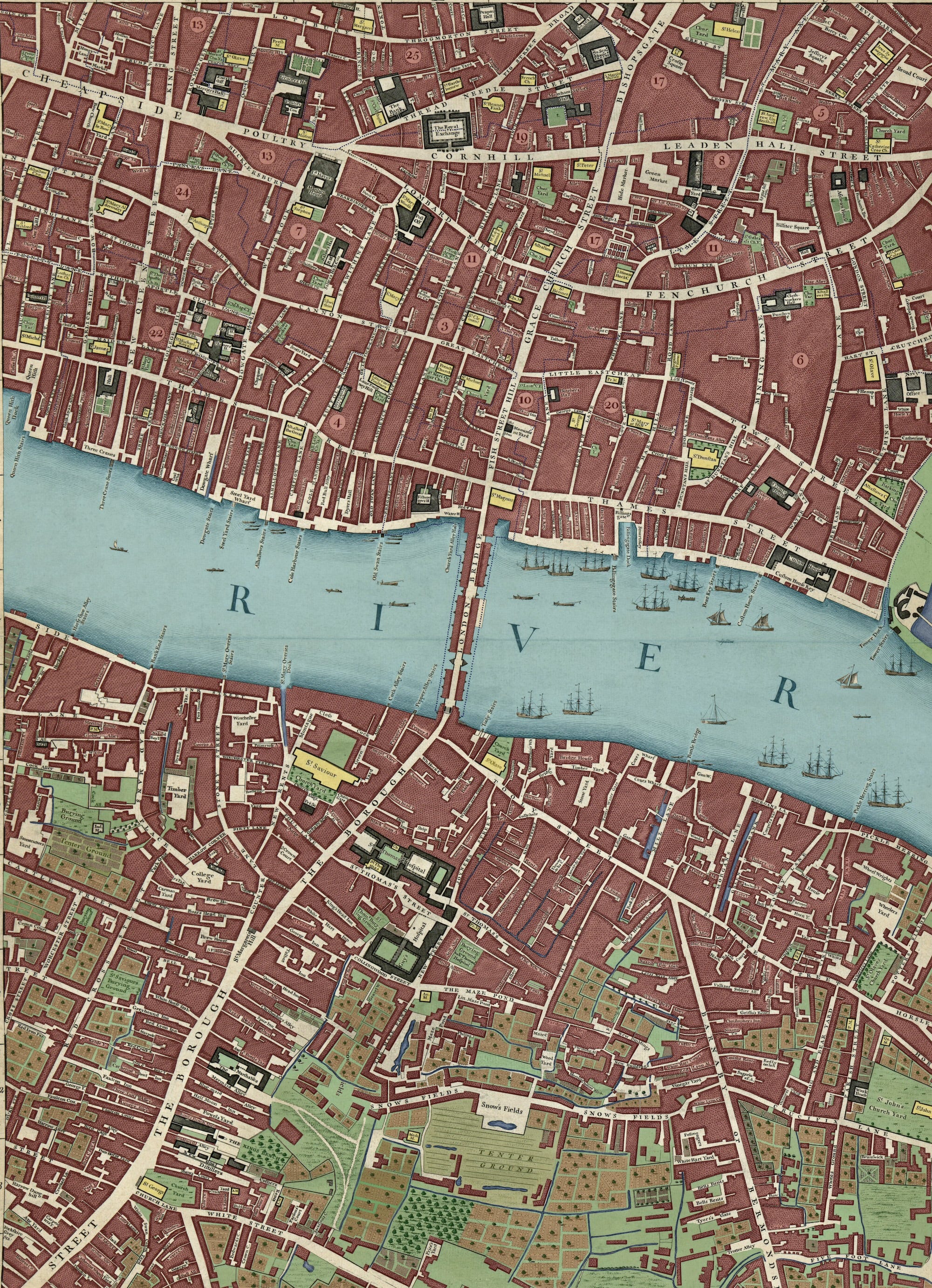
Colourising Georgian Southwark
This panel, like two of the previous installments, is split in twain by the central band of the Thames. The Square Mile north of the river is almost entirely built up, and had been since early medieval times. To the south, however, much of the land is still open field or farmland. It never developed as quickly as the north, largely because of the marshy conditions that prevailed until modern times.
Using colour, we get a clear impression that Borough and Bermondsey grew up along two roads. First, the ancient Borough High Street, whose alignment goes back to the earliest Roman times. The second ribbon of development clusters along what is now Bermondsey Street (labelled here as Barnaby Street). This road led to Bermondsey Abbey, an important religious house until Henry VIII dissolved it, 200 years before Rocque’s map.
The area is very different to modern Borough, though we can also see many survivors. The large church near London Bridge labelled St Saviour’s is what today we call Southwark Cathedral. Montague Close still wraps around to its north, but it does not yet link up with Tooley Street to the east.
A little to the south-east we find Guy’s hospital. When the map was drawn up in 1746, this now venerable medical facility was still in its infancy. It stands beside the much older St Thomas’s Hospital. This has since moved to Lambeth, but the church of St Thomas (small yellow square on the map) remains as the Old Operating Theatre museum. Nearby, we discover why Great Maze Pond — a curious street name that still exists — was so named. It has a great pond. Not sure about the ‘Maze’ bit, mind. The adjacent ‘Snow’s Fields’ are an extensive network of open fields. It lives on today as the minor road called Snowsfields, now fully built up.
Borough High Street follows its long-established course, still familiar in the 2020s. The first thing you notice is the preposterous number of alleyways issuing like millipede legs from either side. Some remain today (see my guide), but only a tiny fraction. Curiously, the map makes no mention of Borough Market, which is today the area’s most popular draw. The market if famously ancient. Its origins are uncertain, but it was certainly trading by the 12th century. It does not show up on the map because, in Rocque’s time, the traders simply set up stall along Borough High Street, causing something of a nuisance for traffic. This arrangement was not to last much longer. In 1755, the market was ordered away from the high street to a new site in 3 Crown Court (shown on the map a little south of Southwark Cathedral). From this nucleus evolved the modern market.
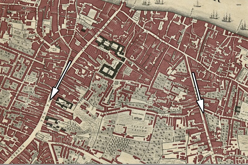
We find many an unsavoury street name when looking around this area. Harrow Dung Hill, toward the bottom-left of the map is now Sanctuary Street behind Borough tube station. Naked Boy Alley (lower centre right, but one of three on the map) is now covered by railway arches at the top of Bermondsey Street. Most striking of all is “Whore’s Nest”, which you can find just above the sizeable College Yard to the centre-left. I’m delighted to report that this short alley was eventually built over, and is now home to the Market Porter, one of the area’s finest pubs. Wonder if they know.
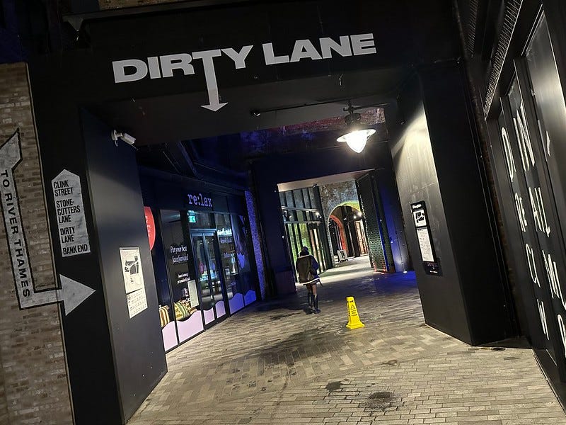
Whore’s Nest was just around the corner from Dirty Lane and Foul Lane. All three had long vanished from the street map, but Dirty Lane has now made an unlikely comeback (albeit in a slightly different location) thanks to the Borough Yards development:
Across London Bridge
London Bridge at this time was still crowded with buildings, resting on arches from the 13th century. It appears so calm and orderly on the John Rocque map.
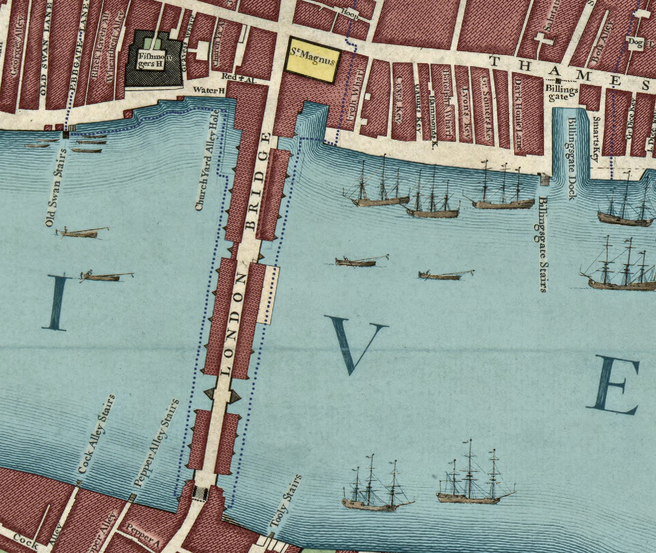
In reality, this was still the only place to cross the Thames on foot or wagon, and anyone attempting to do so could expect an almighty bunfight. Westminster Bridge was under construction at this time (and is shown in the Westminster map panel), but it would not open fully until 1750. Hence, London Bridge was frequently at a standstill, with too many people, horses and carts attempting to squeeze along the narrow carriageway. The bridge also formed a barrier to taller ships. This is hinted at in the map, which includes numerous three-masters on the downstream side, but none upstream of the bridge.
This medieval throwback would last another 80 years or so before John Rennie built a replacement just to the west. That London Bridge is the one that now stands in Lake Havasu City, Arizona2.
Into the Square Mile proper, and we find a street plan not dissimilar to the one we know today, albeit with many more riverside lanes. In the 18th century, the central Thames was very much a working port, with dozens of ships docking every day to offload cargo. Hence the broad quay and numerous steps along the riverfront3.
We can spot many other differences as we look around. The Bank of England is marked, but it’s tiny in comparison to the modern fortress. The building was only a decade old at the time of the map. Nearby, the Victorian King William Street is conspicuous in its absence.
This northern part of the map is pebbledashed with churches (yellow) and their churchyards. Many of these still exist, with the former burial plots now serving as pocket parks. It’s interesting to note that St Dunstan-in-the-East (middle-right) is shown as one of the larger and more bosky churchyards. Today, it’s Instagram famous, as the ruined church with the ‘secret’ garden.
I could go on pointing out numerous other details and differences. But the real joy of these maps is in the exploration. Show don’t tell, and all that. So I’ll stop here and leave further perusal to you. Let me know if you spot anything of interest.
Thanks for reading! Do email me on matt@londonist.com if you have any feedback or ideas for future articles, or else leave a comment below.
The original artists were diligent with consistency. Cultivated land is always drawn with a particular hatching, while smaller allotment-style beds are drawn in another. It makes things easy, if laborious, to colour in. However, in some cases it is not clear whether an open space should be dirt, grass, gravel or paved. In such places, I’ve used my intuition and feel for the map to make a guess. Consequently, the maps should be considered as subjective and interpretive rather than hard historical analysis.
Well, partially. Only the stone cladding was shipped over to America, and you can still see part of Rennie’s bridge on the Borough side.
For an excellent account of the development of the various stretches of quayside, see the most recent edition of the London Archaeologist (Vol 17, no 5). It’s the closest that scholarly consideration of medieval maritime infrastructure can get to a page-turner.
Looks beautiful and some of my ancestors were living in Water Lane near the Tower of London around this time, great to see this on a map
Another beautiful job. Do you know when the map will be finished?