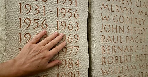
The Under-Appreciated Art of the Letter Carver
London's great letter-chisellers, ancient and modern.
Welcome to Londonist: Time Machine. London has many hand-carved memorials. Have you ever looked closely? I usually read the words and ponder the message, but I’ve never taken the time to appreciate the individual letters. Not until last week, when I met a group of practicing letter carvers. Their skill is astonishing, and it’s one that London has excelled at for many centuries. That’s the topic of this week’s newsletter, but first, a quick announcement:
📣📣 I just wanted to say thank you to the dozens of new readers who’ve signed up for this newsletter in the past week. The article on creative ways to explore London went a little bit viral, and brought in a wider audience than usual. If you’re new here, then you are most welcome. If you’re not-so-new here, then I’m utterly chuffed that you’ve stuck around to read each week. I try to make sure that every article brings a fresh take on London’s history, which you won’t find anywhere else.
Glorious Letters in Stone and Wood
“LONDINIENSI”. The word leaps out. This marble tablet, found by archaeologists on Long Lane, Southwark in 2002, might have been carved yesterday, such is the clarity. Yet two millennia have passed since the stone was marked. The key word means “the Londoners”. It is the oldest known reference to our city — our people — ever uncovered1.
Hand-carved letters are an ancient part of the London streetscape. They are the memory of the city, and the most durable witnesses to its history. We could look to the lengthy descriptions on the sides of the Monument, which describe the Great Fire and its aftermath, and which originally blamed Catholics for the conflagration. Or the sombre carvings within the Tower of London, engraved by prisoners with time to kill while awaiting their own executions. Monuments, markers, tombs and milestones are undistinguished lumps of rock until the letter-carver’s chisel gives them voice. The artist’s handiwork outlives the forgotten royal patrons, bequeathers of drinking fountains, and the municipal worthies on Victorian foundation stones. It will outlive you and me. And sometimes, these long-lingering words can chime anew. This 19th century pediment on Southwark Street could almost be a counter-meme of the “post-truth” era. ⬇️
Hand-carved lettering is one of the most venerable art-forms, but is it still appreciated, still practiced, still needed? What memorials and messages do we chisel into London today? Who views them, and who hews them? Let’s speak to a few letter carvers to find out...
Into St Paul’s
Never declare a ‘thumb war’ with a letter-carving artist.
“We get massive thumb muscles,” reveals Charlotte Howarth. With 35 years’ experience, Charlotte’s grip must be as strong as the stone she carves. “We mostly work on our feet,” she tells me. “There’s a real physicality to it. It’s like dancing”.
Charlotte’s creations can be seen in many places, both private and public. Today we’re at St Paul’s Cathedral to appreciate one of her most notable commissions. The Remember Me memorial sits within the North Transept, and is part of the recently reworked entrance to the building. It pays tribute to the many thousands of people who lost their lives to the Covid-19 pandemic. Elliptical in form, and crafted from English oak, this is the first major addition to the interior of the cathedral in decades.
Charlotte contributed the astonishing gilded lettering that adorns the inside of the memorial. It is an exquisite piece of craftsmanship, as even the untrained eye can see. Take a careful look at the gilded letter ‘M’ below. Imagine you have a chisel and dummy (a specialised mallet) in your hands. Now, wield them in your mind’s eye. Can you, even in fantasy, come close to the masterpiece below?
“You can’t correct mistakes,” Charlotte tells me, as she talks me through the memorial’s creation. One badly timed sneeze and you have to start from scratch. The carved letters on the Covid memorial are done in ‘V-cut’, a technique whereby the interior of the letter slopes down at 45 degrees to a central valley. This reflects light more lustrously than a flat letter, providing a dazzling effect not fully conveyed in the photograph.
The memorial’s deftly meandering letters contrast with older inscriptions within the cathedral. These tend to be formed of Roman lettering, little changed from the precedents laid down 2,000 years ago. Bold, commanding, imperial, this more traditional style is used to commemorate military heroes or other establishment figures. Such rectilinear, stentorian script would not be appropriate for communal remembrance. Charlotte’s warm lettering is inclusive. It upholds dignity while celebrating life. It is carefully attuned to the context.
This is the crux of the letter-carver’s art. It takes years of training; not only to master the dance of the chisel, but also to appreciate the needs of the client, the needs of the site, and the expectations of the viewer. A letter carver’s work may still be in place centuries hence. It will one day become an historical document. A master carver is writing for future generations as well as our own. But where will future letter carvers come from?
Training the next generation
It is possible to get a taster for the letter-carving arts through short courses at City and Guilds of London Art School. Those who want to train professionally have only a few routes. At the forefront is The Lettering Arts Trust (LAT). This non-profit organisation funds apprenticeships, holds workshops, talks and exhibitions, connects artists to commissions and generally tub-thumps for this often-overlooked art-form.
LATs origins lie in tragedy. Back in 1988, Harriet Frazer wanted to erect a personalised memorial to her step-daughter Sophie Behrens, who had taken her own life aged 26. She struggled to find a suitable stone carver, or to get permission from her local church to erect any memorial that wasn’t “off the shelf”. Memorials by Artists was borne of this frustration, an organisation set up by Frazer to help other grieving families find unique memorials. It has since evolved into The Lettering Arts Trust, which has broadened the original mission to celebrate and enable lettering in all its forms. You can go to them with your own commission. Or you can go to them to learn the trade.
Maia Gaffney-Hyde, who joins us on the tour, is currently on an LAT apprenticeship, having previously studied the fine arts and worked in book design. She now trains full-time alongside Charlotte, learning the many intricacies of carving; honing her muscle memory, but also studying historic letter forms as well as the business side of the practice. It’s a two-year apprenticeship, after which Maia hopes to follow in the footsteps of the 10 or so previous LAT apprentices, all of whom have become self-employed letter carvers. Through these apprenticeships, and shorter journeyman courses, LAT is helping to ensure that this ancient art-form has a bright future.
An evolving, living art-form
For much of history, letters were carved by uncelebrated artisans. Every village had its own stonemason, who could chisel words of loss onto gravestones and other memorials. The craft gradually dwindled in the machine age, as did so many traditional highly skilled roles. But the early 20th century saw something of a revival in London.
One unlikely spark was Trajan’s column. Or, rather, the plaster cast copy on display in the V&A.
This monumental facsimile was installed towards the end of the 19th century. It quickly became a muse for London’s designers. Eric Gill was particularly taken by the Roman letters at the base of the column. His Gill Sans typeface was heavily influenced by its forms, and variations began to appear on London’s buildings and memorials2. (Incidentally, the genuine Trajan’s column in Rome is now rather weathered and damaged from over-cleaning. The lettering on the V&A copy is more ‘pristine’, and still studied today.)
Another key calligrapher at this time was Edward Johnston, the famed creator of the typeface used on the London Underground and other transport services. He too was inspired by ancient lettering, and pioneered the use of broad-edged pens to provide simpler letter forms than the traditional copperplate calligraphy. It was a simple but radical departure whose influence is still strong today. Indeed, letter carvers keep ‘family trees’ that usually lead back to Johnston. Charlotte was trained by the sculptor Richard Kindersley, who learned his trade from his father David Kindersley (co-designer of the British Library gates with Lida Lopes Cardozo). Kindersley was in turn apprenticed to Eric Gill. And Gill first picked up calligraphy from Edward Johnston at the Central School of Arts and Crafts in Holborn. This is a very Londony story.
Hanging out with the carvers
“This looks like a Kindersley. These are all Skeltons”.
We’re taking a look around the crypt of St Paul’s with Mark Noad, an LAT trustee (and also noted for his alternative take on the Tube map). The general public are on the hunt for the crypt’s many famous burials such as Wren, Turner, Reynolds and Nelson. Mark, Charlotte and Maia are one step removed. They’re busy identifying which master letter-carver worked on each of the memorials. Charlotte in particular has a keen eye for the idiosyncrasies of different artists.
Larger workshops, I learn, have something of a house style, which can be traced across different memorials. This is, in part, to make it easier for different artists to work on the same project. Master letter carvers like these are a cut above the more numerous (yet still very skilled) memorial masons, who make standardised inscriptions on gravestones and other markers. “It’s a bit like the difference between food from a farmer’s market versus the supermarket,” explains Mark. You might pay a bit more for a master-crafted memorial, but the quality and individuality will show.
Hand-carving with a chisel is not the only way to mark a stone, I learn. Sandblasting over a stencil is much quicker, but cannot achieve the intimacy and expressiveness of hand carving, nor the V-cut seen on the Covid memorial. Automated devices such as CNC machines can also speed up the carving process, though Mark tells me that getting decent results is in itself an art-form.
Even so, the rise of the machines has got to the point where stone carving can even be plagiarised. Mark hints at examples of carefully designed work being copied by machine overseas and passed off as original. To set themselves apart, the traditional letter carver must play with light and shade and make their work ‘sing’, in a way that cannot be reproduced.
I ask Charlotte if she could pass a blindfold test. Could she identify types of stone just from the feel and the sound of the chisel? “Probably, in a lot of cases.” She gives the example of Welsh slate, which has a velvety feel, versus Burlington blue slate which is more gritty. Letter carvers will adjust the style of their lettering to suit the material.
Before we part company, Mark wants to show me an often disregarded memorial near Blackfriars. You may have seen Richard Kindersley’s The Seven Ages of Man — a stack of heads nestled within the brutalist BT buildings above Queen Victoria Street. Kindersley also carved the lettering around the base which, even to my untrained eye is something to behold. This text is carved in relief, with an unusual use of lines down the centre of each letter — a style pioneered by Kindersley. It really pops out.
As I’m about to leave, Mark drops the ultimate bit of trivia. “We’re heading to The Blackfriar pub now. Did you know the lettering on the outside directly influenced the titles in the opening credits of Blackadder II?”
I did not. But yes, it looks like he’s right:
“You should hang around with letterers more often!” suggests Mark, who can see I’m delighted at this revelation. Indeed I should. But really, I’m forever in their company. We all are. Artistic lettering, carved or otherwise, is all about us. The letter-carver’s handiwork is a ubiquitous yet valuable part of the cityscape. To paraphrase Christopher Wren’s epitaph, “If you seek their memorials look around you.”
To learn more about letter carving, take a look around the LAT website, which has information about upcoming events and exhibitions, as well as information about how to commission an artist (or, indeed, train as one). My thanks to Charlotte, Maia and Mark for their time, and to Michael Barrett for putting is in touch.
Thanks for reading. I always love to hear your thoughts in the comments below. Or feel free to email me on matt@londonist.com.
If I’m being honest, the one in the photo was carved yesterday — or relatively recently. It is a replica of the original, placed in the pavement at the western end of Long Lane. But it is carved to the same clarity as the original. The complete meaning of the text is disputed. It is perhaps a marker stone for the premises of a merchant called Tiberinius Celerianus. Clues in the text and the wider site context suggest a date of late second century.
Unfortunately, Gill’s reputation has since been trashed following appalling revelations about his personal life. There have been calls to remove his once-admired sculptures, such as Prospero and Ariel on Broadcasting House, from public display.
Very interesting article. Here are a couple of carving quotes I came across. "A great sculpture can roll down a hill without breaking.” Michelangelo You have to let the viewers come away with their own conclusions. If you dictate what they should think, you’ve lost it.”
— Maya Lin—
Will the Mars Camulus inscription be with us again when the new Museum of London opens?